Blog Archives

Environment Agency
ArcGIS allows us to collect, analyse and share real-time information about major incidents and take rapid action to protect people and the environment.
If there is a serious flood, a prolonged period of drought or a fire, the Environment Agency needs to react quickly to protect people and the environment. Now the organisation is using a suite of ArcGIS solutions to collect, analyse and share information about incidents, as they happen, and respond rapidly and effectively.
Support from Esri UK Professional Services allows extensive functionality to be delivered in a short period of time
Appointment of Esri UK Managed Cloud Services to host and manage emergency response solution is cost-effective and reassuring for in-house team
Integrated suite of mobile, desktop and online ArcGIS solutions enables rapid decision-making based on real-time evidence from the field
The Challenge
The Environment Agency is a Category One responder and works with other emergency services in the UK to help save lives and protect the environment. Every year, the organisation responds to between 20,000 and 50,000 potential incidents, such as floods, drought or water pollution, of which over 40 are typically classed as ‘major incidents’.
During the course of 2015 and 2016, there were a series of devastating floods in the North of England, which endangered people’s safety, damaged homes and the natural environment and impacted the regional economy. Environment Agency staff visited the affected areas where they took detailed notes and photographs to record and monitor the evolving situation on the ground. However, due to the manual and paper-based approach available at the time, this valuable insight had to be processed and analysed, increasing the time it took to reach the Environment Agency’s incident control centres.
“For more than two and a half years, Esri UK has hosted ArcGIS Enterprise, kept it up-to-date and ensured its resilience, enabling us to focus on using the solution to help save lives and protect the environment.”
Nick Jones, Digital Strategy Lead, Environment Agency
The Solution
After the devastating floods, a review of the Environment Agency’s mapping capabilities was carried out, which produced a set of recommendations to improve its incident response capabilities. The organisation then engaged Esri UK’s Professional Services team and drew on the expertise of an Embedded Product Specialist to help it design and deliver a brand new Incident Management (IM) Portal based on Esri’s ArcGIS platform. Nick Jones, Digital Strategy Lead at the Environment Agency said: “Enhancing our existing in house resource by working closely with Esri UK’s Professional Services team allowed us to deliver significant improvements, in a very short period of time.”
Given the critical role that the new IM Portal was going to play in emergency situations, the Environment Agency asked Esri UK to host and manage its ArcGIS platform in the cloud. “We realised it was more cost effective and simpler to take advantage of Esri UK’s Managed Cloud Services than to host the ArcGIS-based solution in-house,” Jones says. “For more than two and a half years, Esri UK has hosted ArcGIS Enterprise, kept it up-to-date and ensured its resilience, enabling our team to focus on using the solution to help save lives and protect the environment.”
Now, over 2,500 field-based employees use Esri’s Collector App for ArcGIS to gather photos, videos, drone footage and flood outlines on their smartphones or tablets. They can upload this data instantly to ArcGIS Online and ArcGIS Enterprise, where it can be viewed by all of the organisation’s 10,000 employees. In the Environment Agency’s incident control centres, around 500 office-based employees use Esri dashboards to analyse the data from the field, along with third party data from drone operators and the Environment Agency’s existing master datasets, historic data and LIDAR.
“Enhancing our existing in house resource by working closely with Esri UK’s Professional Services team allowed us to deliver significant improvements, in a very short period of time.”
Nick Jones, Digital Strategy Lead, Environment Agency
Benefits
Rapid appraisal of an emergency situation
Employees in the Environment Agency’s national incident control centres now receive information from the field, far more quickly, enabling them to make a rapid appraisal of the extent and criticality of major incidents. Essential information is visible on Esri dashboards in seconds, allowing managers to make well-informed, real-time decisions and implement plans more quickly.
Improved public safety
Using the up-to-the-minute information captured with ArcGIS, managers can alert other emergency responders and the general public about emerging situations, as well as improve its planning for future events, to help save lives. In 2019 when a flood defence was breached in Wainfleet, Lincolnshire, following exceptional rainfall, the Environment Agency recorded incident data in Collector App for ArcGIS and this data is now being used to improve the organisation’s systems for warning the public about future flood events in the surrounding area.
More effective responses in major incidents
Critically, the information in the IM Portal helps the Environment Agency to allocate the right teams of people and the right equipment to deal with situations appropriately and without delay. While a fire was blazing at a recycling plant near Sunderland in 2018, the Environment Agency collected information about potential water pollution from the water runoff. The organisation could then dispatch or request specialist teams with the right equipment to block drains and soak up oil deposits to prevent pollution entering nearby watercourses.
Standardised, nationwide processes
An added benefit of the IM Portal and the use of mobile ArcGIS tools in the field is that they have created standardised ways of working across the whole of the country. When a huge tidal surge was forecast to hit the country from the east, the Environment Agency was able to dispatch employees to 90 locations from Newcastle to Penzance to collect data. All the information was recorded in the same way and uploaded instantly to the same dashboard for analysis of the emerging situation.
Better planning for future events
All of the information collected is recorded in ArcGIS Enterprise and used to help the Environment Agency anticipate and plan for future events. Flood data is, for example, incorporated into the organisation’s flood models to help it improve the accuracy of its flood warning systems. In addition, employees can use time and spatial filters on interactive maps to look back at previous incidents and gather intelligence at a national and local level.


Skanska, Costain and STRABAG Joint Venture (SCS JV)
Our industry-leading development of an integrated 3D GIS and BIM solution, GeoBIM, is improving the way employees collaborate and helping us to ensure the successful delivery of the first section of HS2 from Euston to Greater London.
The Skanska, Costain and STRABAG Joint Venture (SCS JV) has improved collaboration on a multi-billion pound engineering project, by integrating 3D GIS and BIM models to create one of the most advanced 3D mapping systems in the UK. Using this state-of-the-art solution, teams can share information and make better decisions to reduce costs and improve safety.
Bespoke solution developed using Esri’s ArcGIS Enterprise and 3D City Information Model
Web app puts BIM models in the 3D geographic context of the environment in which they exist for the first time
Simplicity of ArcGIS web app makes solution easy to use for all the organisation’s employees
The Challenge
The Skanska, Costain and STRABAG Joint Venture (SCS JV) is responsible for delivering a key section of Britain’s new high speed railway line, High Speed 2 (HS2), from Euston to the edge of Greater London. In this multi-billion pound rail infrastructure contract, numerous teams need to work together and communicate effectively to ensure that the best possible decisions are made throughout the duration of the project.
Given the complexity and scale of this development, SCS JV has to be able to properly store, manage, exchange and visualise an extraordinary amount of information and highlight how surrounding areas and assets are being affected by new infrastructure. The organisation therefore relies on both a geographic information system (GIS) solution from Esri UK and a separate Building Information Modelling (BIM) solution. “The goal was to combine the strengths of these two domains and create a single solution that would give our employees all the information they need in one place,” says George Floros, GIS Data Specialist and developer of 3DGIS/BIM at SCS JV.
“Our pioneering work in combining 3D GIS data with 3D BIM is transforming the way that teams collaborate and helping SCS JV to ensure the successful delivery of one of the largest rail infrastructure projects in Europe.”
George Floros, GIS Data Specialist at the Skanska, Costain and STRABAG Joint Venture
The Solution
SCS JV had previously used Esri’s ArcGIS Enterprise to create a series of web apps, making GIS data and mapping tools available to all SCS JV teams working on the HS2 project. “ArcGIS already supported collaboration in our business by giving everyone easy, intuitive access to all our project information in 2D,” says James Gasson, GIS Manager at SCS JV. “What we did next was to move this up a level and create a platform for sharing 3D GIS data, integrated with our 3D BIM data.”
Named GeoBIM, the solution was developed by George Floros in SCS JV, by enriching Esri’s 3D City Information Model, integrating it with other third party tools, and making it available to the team via the ArcGIS Enterprise portal. One of the most advanced 3D GIS systems in the UK, it includes a workflow for inputting BIM data, based on industry standards, open source components and Esri templates.
Now, employees can gain a 3D view of the HS2 route, buildings and surrounding landscape, all in one place for the first time. The ArcGIS solution also allows employees to perform analysis of the 3D environment and query BIM models in ways that were not possible before. Gasson explains: “In the past, employees could view BIM models but there was no contextual information to help them make sense of the diagram. It was just a model hovering in space. The strength of the Esri platform is that it puts BIM models in the 3D context of the urban or rural environment in which they exist.”
Another key advantage of the new ArcGIS-based 3D solution is its ease of use. “By transferring high quality BIM models into ArcGIS, and releasing them via our ArcGIS web apps, we have made it easy for hundreds of employees to explore the route and features of the HS2 project in 3D,” Gasson says. “You don’t need to be a GIS specialist to use the system; anyone, in any role, can view the 3D data in the context of the surrounding geography.”
“By transferring high quality BIM models into ArcGIS, and releasing them via our ArcGIS web apps, we have made it easy for hundreds of employees to explore the route and features of the HS2 project in 3D.”
James Gasson, GIS Manager at the Skanska, Costain and STRABAG Joint Venture
Benefits
Improved collaboration on HS2 development
Using the 3D GIS and BIM solution, employees can now work together more effectively, as they share a deeper understanding of the HS2 route, existing infrastructure and planned new assets. “Our pioneering work in combining 3D GIS data with BIM is transforming the way that teams collaborate and helping SCS JV to ensure the successful delivery of one of the largest rail infrastructure projects in Europe,” Floros says.
More cost efficient project delivery
By minimising the need for site visits, the new 3D GIS and BIM solution also reduces health and safety risks, as accidents are more likely to occur on construction sites. Furthermore, the solution plays a key role in ensuring the safety of HS2’s future employees and passengers, by making it easier for specialist design teams at SCS JV to view and evaluate the proposed emergency exit routes in 3D BIM models and ensure they are placed in the best locations.
Fast, well-informed decision-making
Significantly, the new 3D GIS and BIM solution gives employees at SCS JV fast, easy access to accurate information, which accelerates business processes and helps employees to make the right decisions, the first time, to avoid unnecessary delays in the construction of HS2. “ArcGIS empowers everyone to take measurements and do more technical tasks themselves, without having to wait for an expert to become available, enabling the project to progress more quickly,” Gasson says. “Everyone has access to the accurate data they need to make fast, well-informed decisions and deliver a high quality rail infrastructure for the UK.”

University of Cambridge
ArcGIS has enabled us to enhance data collection, improved processes and sharing of information.
The University of Cambridge’s Estate Management team has a substantial operational estate to maintain. As well as plan for and manage the organisation’s estate development programme, it is also charged with promoting the University’s environmental sustainability initiative. In 2018 the Space Data team created an innovative digital Estate Map with ArcGIS Online, converting data from multiple file formats and introduced new processes to provide accurate estate information to staff and stakeholders.
Significant efficiency savings through new processes.
Improved productivity and accuracy of data collection.
Better sharing of information supporting future initiatives.
The Challenge
With more than 350 operational buildings to sustain, keep secure and safe and nearly 700 acres of land to maintain, the University of Cambridge’s Estate Department manages an operational estate currently valued at £3 billion**. The estate’s broad and complex nature presents many demanding challenges from looking after buildings over 800 years old, Grade 1 Listed and protected by English Heritage and the University Farm, to highly specialised buildings used for teaching and research. In addition, there is an investment portfolio of leased residential and commercial properties. However, while the University of Cambridge is a collegiate university, the University Estate does not include all the College properties.
The Estate Department’s Space Data team is responsible for maintaining source data and keeping an up-to-date record of all CAD drawings and floor plans of the University’s buildings. A major frustration for them was not being able to show this data on one single map in a more detailed way. The University’s official map was limited, showing Cambridge only, whereas the estate has buildings and land assets outside of Cambridge in Ely, Leicester and London. They also relied on a supply of data updates and new additions from colleagues across the department.
The team was looking for a way to improve processes and facilitate improved sharing of information across the University, with people of different skill levels. While the team had no previous working knowledge of GIS, it was keen to identify a system that could maintain data and provide accurate estate information to staff and stakeholders.
** Insurance Replacement Cost February 2019
“The new digital Estate Map is not just useful for me, but when explaining where a department is and who is the best contact to other colleagues at the University. It’s a valuable tool which I’m sure I will use on a regular basis.”
Steve Matthews, Facilities Support Manager, University of Cambridge
The Solution
Following its attendance at an AUDE (the Association of University Directors of Estates) facilities management event, the Space Data team recognised the potential of ArcGIS as the software platform that could not only fulfil its primary requirements, but also create a valuable gateway to further information and functions. The University had been using ArcGIS as a teaching tool for years, but the technology had not previously been used for the administration of data and asset management, or as a sharing and collaboration tool.
“We were really keen to learn how we could use ArcGIS to improve processes and to make our work more visible, making it easier for people to understand what we own and what we have an interest in,” said Dawn Birch, Estate Data Coordinator, Space Data Team, University of Cambridge.
The team contracted an Esri Professional Services Embedded Product Specialist (EPS), an experienced GIS expert, who worked with the Space Data team, three days a week, in their office in Cambridge. Given the Space Data team was relatively new to GIS and had only had a few days training, the EPS worked in close collaboration with them showing how to bring new GIS ideas to life and embed ArcGIS functionality into existing business processes. The EPS also passed on knowledge and helped drive a new exchange of ideas on how the team could benefit from the latest enhancements to the ArcGIS platform.
Initially the team used ArcGIS Pro to convert its CAD data to GIS formats to use in ArcGIS Online. Processes were put in place to manage all internal data and make it accessible in an organised folder structure. Visualising the data in a digital Estate Map was the first time that the entirety of the estate’s holdings could be seen and explored in one place. Using existing CAD data appended to OS MasterMap data, extruded by building height, the new 3D map delivered a completely different perspective of the whole campus.
In terms of data collection, estate surveys had previously been undertaken using unreliable paper-based collection. The Space Data team replaced this process with mobile data collection using the Survey123 for ArcGIS app, a digital solution that works on smart devices, laptops or desktops even in disconnected environments. Surveyors were able to highlight more precise details of where buildings and assets such as bicycle sheds are located and, having purchased a new GNSS receiver, are now working alongside their IT colleagues on hosting and updating the entire cable network within ArcGIS.
The EPS engagement also led to the Space Data team joining Esri’s Early Adopter Community, giving them the opportunity to try the latest Esri technology before its public release.
“We were really keen to learn how we could use ArcGIS to improve processes and make our work more visible, making it easier for people to understand what we own and what we have an interest in.”
Dawn Birch, Estate Data Coordinator, Space Data Team, University of Cambridge
Benefits
Improved Sharing of Information
Estate holdings are more transparent and visible through the digital Estate Map and can be viewed and explored in one place. It replaces previous silos of data and information held across different departments, making vital information and accurate updates and additions available to stakeholders across the organisation. Explorer mobile App for ArcGIS also gives colleagues access to data and the digital Estate Map while out and around the estate.
Better Exploitation of Existing Data
The team can now view and map biodiversity data relating to the estate, visualising data that they had not been able to previously do so. This includes where current land is in relation to buildings, site boundaries, city wildlife sightings, local nature reserves and water features; data that previously existed but the team had been unable to visualise and share in meaningful way.
Process Improvements and Increased Operational Efficiency
Digital recreation of previously paper-based surveys has resulted in significant resource savings. Office-based employees no longer need to manually enter data into spreadsheets and databases as this can be undertaken in real-time, by surveyors out on the estate, using ArcGIS mobile apps.
Supporting Future Planning
Multiple projects using ArcGIS have been earmarked to support better decision-making regarding both asset management and sustainability goals. These include tree surveys, sustainability maps and accommodation plans. As the University already used ArcGIS for teaching purposes, it has been able to extend its use of the ArcGIS platform for minimal cost.
Black & Veatch
We have worked successfully with the Environment Agency and other stakeholders, using ArcGIS to design and share a new vision for the future of the Burton and Trent Washlands.
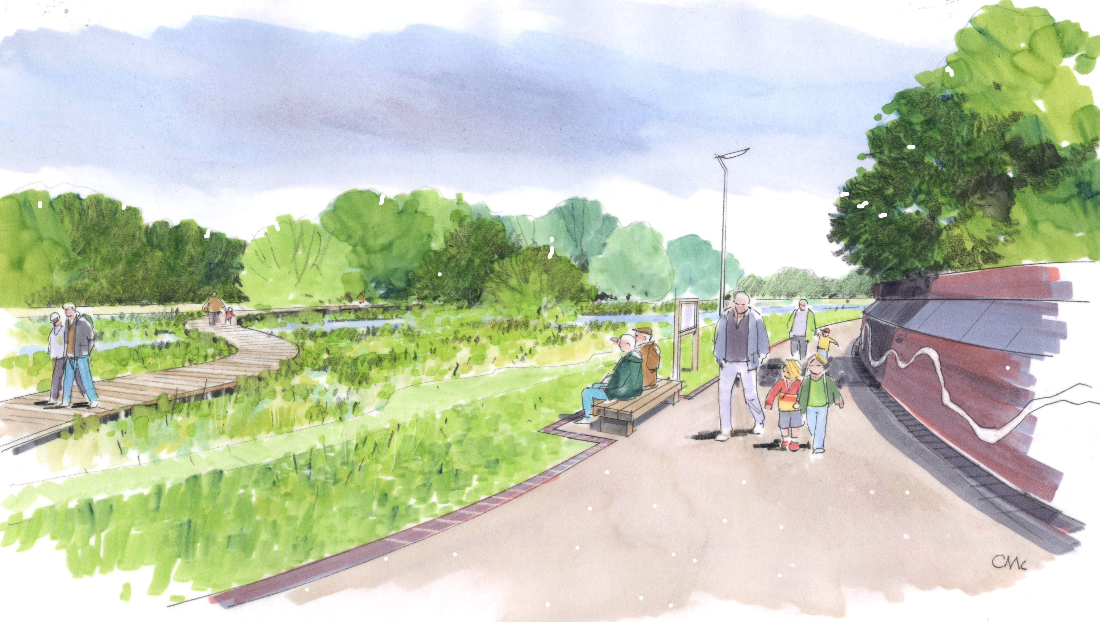
In an award-winning project in Staffordshire, Black & Veatch used ArcGIS to work collaboratively with partners and design a multi-million pound wetlands development project. It then built consensus for the scheme using an ArcGIS Story Map to engage the public in consultations, attract funding and gain support from diverse stakeholders.
Landscape architects and environmentalists share information in ArcGIS Online to enhance their site knowledge
Data and plans from multiple stakeholders are incorporated into ArcGIS Online to create a collaborative design
Members of the public and local groups engage effectively in public consultations using interactive Story Maps
The Challenge
Working on behalf of the Environment Agency, through the Water and Environment Management (WEM) Framework, the engineering, procurement, consulting and construction company Black & Veatch was set the challenge of reimagining a 630 hectare floodplain near Burton-upon-Trent. The Environment Agency didn’t just want to develop the area’s role as a natural flood defence; it also wanted to improve the biodiversity of the wetland and enhance the recreational value of the environment for visitors.
Previously, several conservation groups, the local authorities and Natural England had produced plans relating to parts of the region, but there was no overarching vision for the entire floodplain. Black & Veatch was, therefore, asked to work with a variety of partners and stakeholders to produce a new Landscape Vision for the Burton and Trent Washlands that would raise the quality of the whole area, create sustainable natural habitats for wildlife and deliver benefits for the local community.
“ArcGIS helped us to consolidate the views of a wide range of organisations and groups when developing the new Landscape Vision for the Washlands and ensure that our designs complemented the existing features of the area.”
Paul Hart, GIS Manager, Black & Veatch
The Solution
A long-standing user of Esri’s ArcGIS platform, Black & Veatch used Esri’s cloud solution, ArcGIS Online, to consolidate environmental data about the area and previous landscape studies from a large number of partners, including East Staffordshire Borough Council, Staffordshire Wildlife Trust and The National Forest. The firm was able to incorporate layers of data into ArcGIS Online on everything from built assets and historical records to natural features and make all this information available to everyone on the project team to improve communication and inform their design choices.
Whenever employees went on site, they used Esri’s Collector App for ArcGIS on tablets or smartphones to capture new data or pictures, upload it to ArcGIS Online and enhance the team’s collective knowledge of the region. Any member of the Black & Veatch team could add information to ArcGIS Online, make web maps and share them with other users. Team members could also use blank map layers within ArcGIS to propose new design ideas for the area and allow colleagues to view them on digital maps, in the correct geographic context.
Once the Landscape Vision was formulated, Black & Veatch developed an ArcGIS Story Map to share its proposals with partners, stakeholders and the local community. Highly interactive, this Story Map allows people to zoom into specific parts of the site, find out about the quality of the ecosystem, recognise existing historical features and see planned new infrastructure like paths and playgrounds. The Story Map was published on the East Staffordshire Borough Council website, shared with stakeholders and displayed on large screens at public consultations.
“ArcGIS enabled multiple stakeholders to create a shared vision for the future of the Burton Washlands and then communicate that vision to local people in a way that completely captured their imagination.”
Mark Boothroyd, Chief Landscape Architect, Black & Veatch
Benefits
A collaborative approach to design
Through the use of ArcGIS Online, Black & Veatch was able to create a Landscape Vision for the Burton-upon-Trent Washlands that took into account the data and earlier proposals from a wide range of other organisations and conservation groups. The Black & Veatch team could also more effectively consider existing landscape features, buildings and areas of historical significance, as information on all these pertinent factors was available to them within ArcGIS Online. “ArcGIS helped us to consolidate the views of a wide range of organisations and groups when developing the new Landscape Vision for the Washlands and ensure that our designs complemented the existing features of the area,” says Paul Hart, GIS Manager at Black & Veatch.
Effective engagement with the public
The Story Map played a vital role in helping Black & Veatch and the Environment Agency to share the Landscape Vision with stakeholders, partners and the general public and gain buy-in for the scheme. In particular, the use of the Story Map at public consultations made it much easier for local people and community groups, such as angling clubs, to understand the development plans and contribute their views. “ArcGIS enabled multiple stakeholders to create a shared vision for the future of the Burton Washlands and then communicate that vision to local people in a way that completely captured their imagination,” says Mark Boothroyd, Chief Landscape Architect at Black & Veatch.
Evidence to support funding bids
The partners involved in the project are now continuing to use the Story Map to present information about the scheme in an accessible format, to help them secure the funding that will be necessary to deliver this £6 million pound scheme. For instance, the Story Map has provided Staffordshire Borough Council with the evidence it needed to justify the allocation of public funds to the project. The Story Map has also been shared with a number of local and national grant-awarding bodies to help the partners gain the financial support to turn their vision into a reality.
Success in prestigious awards
In November 2018, Black & Veatch won a prestigious Landscape Institute Award for the Burton and Trent Washlands project, with judges praising the company for the way in which it engaged with the public. “ArcGIS played a big part in the success of the project,” Boothroyd says. “ArcGIS helped us to produce and share a vision for the Burton and Trent Washlands that everyone could feel excited about.”

Worcestershire County Council
Our social workers use ArcGIS to help Worcestershire residents engage more actively in community-based activities and have a better quality of life.
Adult social work teams in Worcestershire County Council are now using a suite of ArcGIS solutions to help them provide people with relevant, up-to-date information about community services. As a result, social workers are saving time, while encouraging more people to engage in activities that will help them live healthier, more fulfilling lives.
Individuals and their families receive information on a wider range of local community resources
Social work teams save time and provide relevant information to people much more quickly
Worcestershire County Council achieves its vision to help people maintain their quality of life and independence
The Challenge
A key part of Worcestershire County Council’s published vision is to ensure that “Worcestershire residents are healthier, live longer, have a better quality of life and remain independent for as long as possible.” Consequently, the council’s Adult Social Care teams work proactively with people, to encourage them to engage in activities that could improve their sense of well-being and ultimately prevent, reduce or delay the need for care.
The council’s social work teams previously recorded information manually in team folders about events and activities that might be beneficial to the people in the county. These community assets range from support sessions for people with hearing loss to knitting groups and fitness classes for older people. Whenever they wanted to find out about a community service, they had to return to the office to check the database and write down the details to take to their next meeting with the person they were supporting, which took a considerable amount of time.
“People who have disabilities or are lonely can receive information about community services that are specifically suited to their needs, much more quickly, and begin to engage in these potentially life-enriching activities sooner.”
James Price, GIS Developer at Worcestershire County Council
The Solution
A long-term user of Esri’s ArcGIS platform, Worcestershire County Council used its existing ArcGIS license to transform this manual process and create a solution for the Adult Social Care team, comprising three integrated Community Assets Tools (CATs).
1. Capturing data
The first tool uses Esri’s Survey123 for ArcGIS to allow workers to collect information about new community-based services using their mobile devices, while they are in the field. They can add new support groups or activities, upload details, such as contact numbers, and click tick boxes to indicate which types of people might benefit from this service. Users can also update existing records to notify colleagues of changes in opening hours, for example.
2. Verifying data
The data collected using Survey123 for ArcGIS can then be reviewed, edited and verified by office-based staff using an ArcGIS Server web app. This second tool allows the council to control what data is shared among the Adult Social Care teams, as well as add supplementary information that may be helpful for potential service users. The directory currently includes over 235 assets ranging from walking groups for young adults with learning difficulties to craft sessions for older people with dementia.
3. Searching data
The third tool is another ArcGIS web app that allows everyone in the Adult Social Care teams to search for and find services relevant to their clients, either from a desk or from their mobile devices when they are with their clients. Social workers can click tick boxes to fine tune their search and find services specifically relevant to their client’s needs and within a short distance of their home. From within this web app, social workers can also email details of relevant community services to their clients, including map-based directions.
“The ArcGIS apps help social workers to introduce people to local support groups that they weren’t previously aware of.”
James Price, GIS Developer at Worcestershire County Council
Benefits
A better quality of life
People in Worcestershire can now receive information about a wider range of activities that may help to improve their quality of life. Even small support groups, which just one or two council workers may have known about before, are now included in the ArcGIS directory and shared with everyone in the Adult Social Care teams. “The ArcGIS apps help social workers to introduce people to local support groups that they weren’t previously aware of,” says James Price, GIS Developer at Worcestershire County Council. “People can then make new friends, access support to help them live independently for longer and have a greater feeling of control over their lives.”
Faster delivery of relevant advice in the community
For the first time, social workers or social care workers in Worcestershire can search for and share information about community assets using mobile devices, while with their clients. As a result, they can deliver relevant advice much more quickly and even email details and directions to clients straight away. “This is a huge benefit for people in Worcestershire,” says Price. “People who have disabilities or are lonely can receive information about community services that are specifically suited to their needs, much more quickly, and begin to engage in these potentially life-enriching activities sooner.”
Improved efficiency in Adult Social Care teams
Social workers and social care workers can potentially save time using the ArcGIS solutions, as they no longer have to manually type information into the central database or allocate time in the office to searching for community assets. Uploading information about a service using Survey123 for ArcGIS now takes social workers just five minutes or less on their mobile devices, whereas previously, it might have taken them up to 15 minutes to do, days or even weeks later, when they were next in the office.
Support for Three Conversation Model
The ArcGIS-based CATs complement the council’s Three Conversation Model, a newly introduced approach to delivering services in the community that has been developed to help the council communicate with people in a simpler, more personalised way. “Our focus is on listening to people so that we can get a better understanding of their goals, interests and areas where they need support,” says Elisabeth Sheppard, Three Conversation Model Development Practitioner at Worcestershire County Council. “ArcGIS supports the Three Conversation Model by helping us connect people to the appropriate local community options.”
National Trust
We are proactively reducing the risks from falling trees and branches, to protect our visitors, volunteers, staff and property, using a solution we developed with Esri’s ArcGIS.
The National Trust needs to monitor the condition of over twelve million trees, including several that are thousands of years old, to reduce the risk of injuries from falling branches. The charity now uses Esri’s ArcGIS to help it inspect trees more efficiently and ensure its compliance with statutory regulations for tree management.
Rangers complete inspections in the field more efficiently using a mobile app rather than paper forms
Managers have clear visibility of the status of inspections and outstanding actions across all properties
Tree surgeons and estates teams get faster notifications of issues so can quickly take action to reduce risks
The Challenge
Some the oldest, rarest and most famous trees in England, Wales and Northern Ireland can be found on land owned and managed by the National Trust. In total, the charity cares for approximately twelve million trees including 40,000 that are notable for their age, size or historical significance. The National Trust, like all landowners, has a statutory duty to reduce the risk to people and property from falling trees and branches and therefore faces the mammoth task of having to assess the condition of thousands of trees every year, so that everyone can enjoy the outdoors.
Previously, National Trust rangers used a well-established paper-based process to inspect trees and collect data in the field, but paper forms often got wet or damaged and needed to be completed again. When rangers returned to the office, key actions were extracted from the initial paper forms into another paper form, and details about any tree maintenance work required was passed to rangers or handed to contractors, using paper once again. As all the tree inspection forms were kept in lever-arch files at local site offices, National Trust staff in central and regional hubs had limited visibility of the risks across multiple properties and the status of remedial actions.
“The ArcGIS solution gives our operational managers and insurers the assurance that we are effectively balancing our commitment to public access with an excellent system for managing public safety.”
Graham Clowes, Head of Operational Risk, National Trust
The Solution
To transform the way that it manages trees, the National Trust developed a Tree Safety Management (TSM) app using its existing licence for Esri’s ArcGIS and rangers’ entry-level Android phones connected via Bluetooth to low-cost GPS devices. Rangers use Esri’s Collector App for ArcGIS offline in the field to record tree locations, inspection results and actions, as well as gather photos of any potential hazards. This inspection information is then synced to a central repository for tree data on ArcGIS Server, and actions are allocated to the right teams, with no manual intervention or paper. Managers can view identified risks and the status of remedial actions online, using a custom web mapping application built on Esri’s ArcGIS Server technology using Latitude Geographics software (platinum partner).
Within just six months, over 190 rangers signed up to use the TSM app and together collected almost 3,000 tree records in the field using the solution. In addition, the National Trust integrated a further 2,000 tree records from historic systems from key locations such as Dyrham Park near Bath. The charity is currently rolling out training for all rangers in the use of the TSM app and anticipates that the solution will become mandatory for all TSM inspections, carried out by over 600 rangers, by 2021.
In developing this app, the National Trust gained guidance from GIS experts within Esri UK’s Professional Services team. “Esri UK’s consultants gave us peace of mind that we were doing the right thing,” says Richard Martin, GIS Analyst at the National Trust. “The consultants also gave us a heads-up about new technology that might be advantageous to us as we continue to develop this and other ArcGIS solutions in the future.”
“Esri UK’s consultants gave us peace of mind that we were doing the right thing.”
Richard Martin, GIS Analyst, National Trust
Benefits
Improved management of risks
The new ArcGIS-based TSM solution improves risk management by providing managers with greater transparency, across the end-to-end process from tree survey to defect remediation, across all properties managed by the National Trust. “The Tree Safety Management app helps the National Trust manage a significant risk to life and limb, through the provision of a simple, user-friendly tree inspection system,” says Graham Clowes, Head of Operational Risk at the National Trust. “The ArcGIS solution gives our operational managers and insurers the assurance that we are effectively balancing our commitment to public access with an excellent system for managing public safety.”
Faster implementation of safety measures
The new TSM app helps the National Trust to ensure that urgent tree maintenance issues are dealt with promptly to protect the general public, volunteers, staff and property. The app allows remedial works to be completed faster, because actions identified in inspection reports are sent more quickly to the correct teams. In addition, the app has eliminated inconsistencies in approach that previously existed between different properties and regions, so actions are prioritised and allocated in a standardised and efficient way.
Time savings for mobile workforce
Although the app has only been in use for a few months, it is already making a notable impact on staff efficiency in the field. The solution cuts out several steps in the completion of forms and production of contractor schedules, reduces the amount of time rangers spend in the office and alleviates business continuity issues when employees leave. National Trust Ranger Richard Newman has seen a huge improvement in his efficiency. He says, “This app has made it so easy, I can, in real time, look at what work needs to be done and map its location. This has meant I am already a month ahead of this time last year. It is so easy to use I have managed to teach my three volunteer tree rangers and our property gardener to use it and use it well.”
High employee satisfaction
The National Trust took a great deal of care in developing the ArcGIS solution to ensure that it met the requirements of rangers – and this diligence has paid off with a high level of user satisfaction. In a survey of 70 rangers, 91% of respondents agreed that the ArcGIS solution has a positive impact on TSM in the National Trust. Furthermore, respondents awarded the solution 9 out of 10 for improving their efficiency in completing TSM inspections.

Thames Water
From planning visits to food businesses to monitoring and analysing the results of our interventions, we are using ArcGIS in every step we take to reduce blockages from fatbergs in London’s sewers.
It costs up to £1 million a month to clear blockages in the Thames Water catchment area, many of which are formed from congealed fat, oil and grease (FOG). Now, Thames Water is tackling the cause of these fatbergs by using a range of ArcGIS solutions to encourage food businesses in London and the Thames Valley to dispose of fat, oil and grease more responsibly.
Accurate, consistent data viewed, collected and shared in the field
Insight gained by monitoring programme in real-time and analysing behavioural change
End-to-end process created using out of the box capabilities with guidance from Esri UK’s Professional Services team
The Challenge
Every year, Thames Water clears about 80,000 blockages from its underground sewerage network, of which as many as 40% are caused by FOG A significant proportion of the fatbergs that are formed from FOG waste in Thames Water’s network can be traced back to 43,000 restaurants and food retailers in London and the Thames Valley. Many of these businesses do not have effective FOG disposal practices and are therefore in breach of UK regulations.
Given the enormous cost of clearing fatbergs, Thames Water decided to launch a proactive programme of education to make food businesses in London aware of their legal obligations and encourage them to dispose of their FOG more responsibly. The utility needed to be able to monitor the progress of this new Network Protection Programme, ensure a consistent approach with all food businesses and collect data to support any prosecutions as a measure of last resort.
“Esri UK’s Professional Services team made us aware of the full range of capabilities of ArcGIS and showed us how we could make best use of out-of-the-box functionality in the ArcGIS platform to achieve our goals without custom development.”
Chris Hinton, Asset Performance Insight Manager, Thames Water
The Solution
Thames Water’s Technical Information team collaborated with Esri UK’s Professional Services team and members of the Network Protection team to build, develop and maintain a solution for the company’s new Network Protection Programme. The complete, end-to-end process was created using the company’s pre-existing ArcGIS Enterprise and ArcGIS Online platforms, utilising out-of-the box-functionality with no additional software licensing costs.
- Firstly, Thames Water uses ArcGIS Desktop and the Data Interoperability extension for ArcGIS to analyse the locations of fatbergs and flooding incidents and identify hotspots where education initiatives should be prioritised.
- The results of this analysis are then presented on ArcGIS Online in a visual format, allowing Thames Water’s employees to see blockage incidents and risks in a visual format, on an interactive map, for the first time.
- Twelve investigators are allocated batches of establishments, in the priority areas, and use Survey 123 for ArcGIS on mobile devices to record details about their visits to each individual business, collect data about current FOG management practices, so that this can be monitored over time and note details about what advisory letters they left with owners.
- When investigators make follow-up visits, they use Explorer for ArcGIS to view existing records on mobile devices and Collector App for ArcGIS record any updates, such as the installation of grease traps.
- If a blockage results in a flood or other issue, Thames Water uses the Workforce App for ArcGIS to direct nearby investigators to the affected area, so they can visit food premises nearby that may have directly contributed to the emergency.
- Back in the office, programme managers use an Esri Operations Dashboard to get real-time oversight of investigators’ progress, including the number of visits undertaken per premise.
- Finally, Thames Water’s analysts use ArcGIS Desktop and the Data Interoperability extension for ArcGIS to model where food businesses have adopted better FOG disposal practices.
“We created a unique and industry-first tool,” says Natalia Syrovatskaya, Data Analyst at Thames Water. “The collaborative approach, working with Esri UK’s Professional Services team, ensured maximum knowledge transfer and produced great results, delivered effectively and expediently.”
“ArcGIS is an important tool that is helping us to change behaviour and reduce the amount of fat that is discharged into London’s sewers.”
Lauren Makowski, Network Protection Manager, Thames Water
Benefits
Increased adoption of correct FOG disposal practices
The ArcGIS-driven process is having a significant impact on FOG management across the Thames Water region. During the initial pilot, three investigators visited 1,000 food businesses and found that 90% of them did not have effective grease management in place. Following these findings, the team was expanded to twelve, and in 2018 visited over 5000 premises. ArcGIS analysis reveals that if visited three times, 50% of food businesses changed their behaviour and instigated more appropriate FOG disposal practices.
Anticipated reductions in sewer clearance costs
While this initiative is one of several measures that Thames Water is taking to improve the condition of sewers, the organisation believes that the ArcGIS-driven programme will help it to reduce sewer clearance costs. Lauren Makowski, Network Protection Manager at Thames Water says, “ArcGIS is an important tool that is helping us to change behaviour and reduce the amount of fat that is discharged into London’s sewers. This Network Protection Programme, together with Thames Water’s other sewer management initiatives, will undoubtedly contribute to an improvement in the condition of London’s sewers in the long term and reduce the amount of money spent on clearing blockages.”
Efficient collection of accurate data
Using Esri solutions, Thames Water now has a complete, end-to-end process for tackling the mounting fatberg challenge in a highly efficient way. Investigators can work more productively in the field and collect consistent, accurate data that can be used as evidence in prosecutions if necessary. Furthermore, ArcGIS directs them to priority areas so they can focus their time and resources where they will have the greatest impact. Managers can monitor investigators’ progress in real-time and manage the overall programme more effectively, while analysts can study how changes in behaviour have impacted changes in network performance and use this information to monitor the success of the programme.
Valuable guidance from ArcGIS experts
The expertise and guidance provided by Esri UK’s Professional Services team helped Thames Water to build a GIS-led process that precisely meets the needs of the business, as Chris Hinton, Asset Performance Insight Manager at Thames Water explains. “Esri UK’s Professional Services team made us aware of the full range of capabilities of ArcGIS and showed us how we could make best use of out-of-the-box functionality in the ArcGIS platform to achieve our goals, without custom development,” he says. “The consultants have shown us what is possible and we can now put this knowledge to use in other projects too.”
Broads Authority
ArcGIS has enabled us to develop a more efficient, end-to-end process for identifying maintenance requirements, escalating issues and planning repair programmes.
In the Broads National Park, Esri’s ArcGIS platform is helping to improve the maintenance of a 200 km network of navigable waterways. Employees work more efficiently by using ArcGIS to collect information about maintenance requirements in the field and have better information for planning maintenance activities.
Rangers work more effectively by collecting and uploading data electronically from the field
Maintenance requests are sent automatically to the right teams, without a delay for collating and processing spreadshets
Employees have better information to help them plan and prioritise maintenance tasks
The Challenge
The Broads Authority is responsible for managing and conserving the Broads National Park in Norfolk and Suffolk. Covering an area of 303 km2, the park is the largest area of protected wetland in Britain and provides a precious habitat for a quarter of Britain’s rarest species of animals, birds, insects and plants.
Throughout the year, teams of rangers at the Broads Authority perform fortnightly or monthly site checks of around 110 sites and an annual visual inspection of assets along the park’s 200km network of navigable waterways, checking that signage isn’t missing, mooring posts are secure and channel markers are not damaged. Rangers used to record details about any maintenance required on paper and in spreadsheets, and this information then had to be centrally collated in a manual process that took two days per month. The Broads Authority wanted to improve the efficiency of this maintenance checks process, as well as gain better information to support its ongoing maintenance planning.
The Solution
The Broads Authority had been using geographic information system (GIS) solutions from Esri for a many years and had recently upgraded to Esri’s ArcGIS Enterprise. This platform gave it access to all the mobile data collection, visualisation and analysis tools it needed to transform its maintenance checks process.
Now, up to twenty rangers use Collector App for ArcGIS on tablets to record any assets that are broken, missing or in need of other maintenance. This data is uploaded electronically to ArcGIS Enterprise and collated with no manual intervention or delays. As soon as ArcGIS Enterprise receives new maintenance requests, email alerts are generated via integration with a third party workflow tool to notify teams immediately of repairs needed and ensure urgent issues are escalated promptly.
Furthermore, all of the organisation’s 130 employees can use an ArcGIS web app to view the status of maintenance requirements via interactive maps. ArcGIS is tightly integrated with Microsoft SharePoint, so employees can zoom into any area of the park in the ArcGIS web map, view all maintenance issues at that site and click on the asset to go directly to relevant reports or policy documents in SharePoint. Rangers can easily see the status of faults they have reported, while managers can perform geospatial analysis of resolved and outstanding maintenance requests to help them identify any recurring issues and determine appropriate action.
“ArcGIS gives us the ability to collect, visualise, analyse and share all kinds of data more efficiently.”
Vicky Short, GIS Officer, Broads Authority
Benefits
A more efficient maintenance process
The new ArcGIS maintenance checks process has eliminated up to 24 days of manual data collation a year and created a far more efficient, end-to-end process for reporting and resolving maintenance issues. Rangers work more efficiently in the field, using Collector App to collect data instead of paper and spreadsheets. When they identify concerns, such as a bent ladder or missing sign, the matter is escalated electronically from the field directly to the right team.
Better-informed decision making
The use of ArcGIS gives the Broads Authority improved insight into past and current maintenance issues, enabling it to make better-informed decisions and plan repairs more strategically and cost efficiently. Employees can, for instance, easily see if a section of river bank has collapsed two years running and plan remedial work to reinforce it, eliminating further reactive repair costs, year after year.
A single system for park information
The ArcGIS platform provides the Broads Authority with a single system for viewing and sharing park information, in place of a series of disparate systems. Employees can, therefore, find information far more quickly and switch effortlessly between the ArcGIS web map and related documents in SharePoint. For example, planning policy officers can now more easily identify which policies apply where and use this information to comment effectively on proposals from nearby councils.
An inspiration for future GIS projects
Following the success of the maintenance checks process, the Broads Authority is now developing new ArcGIS solutions to improve the efficiency of several ecology projects, including a survey of the condition of water plants. “The maintenance checks process has been a pivotal GIS project at the Broads Authority,” says Vicky Short, GIS Officer at the Broads Authority. “It has really showcased what ArcGIS can do and now I have lots of people knocking on my door with ideas! ArcGIS gives us the ability to collect, visualise, analyse and share all kinds of data more efficiently.”

Mott MacDonald
ArcGIS has transformed the way that we share information across our enterprise, within project teams, with clients and for the general public.
Mott MacDonald has significantly improved its efficiency in multimillion pound, global projects, by using Esri’s ArcGIS to transform the way that it shares information both within and beyond its enterprise. Project teams can now collaborate more effectively, deliver added value for clients and engage successfully with the public in consultations.
Improved efficiency and collaboration from using ArcGIS to share data within teams
Enhanced customer services from using ArcGIS to collect & share data visually with clients
Effective public consultations from using ArcGIS to share data with citizens
The Challenge
The global engineering, management and development consultancy Mott MacDonald undertakes a vast array of projects all around the world, ranging from assessing the risk of climate change impacts, designing critical infrastructure across Central Asia and improving flood defences in the UK, to safeguarding turtles' nesting beaches in Cyprus. Common to all these projects is the company’s goal to operate as efficiently as possible and use leading-edge technology to create value for clients.
The organisation had used geographic information system (GIS) solutions for many years, in some teams and some offices. However, this silo-based approach meant that GIS services and data were limited to a small number of users. There was no standard central GIS system across the company where everyone could view the same project GIS data, and this inhibited employees’ ability to share data effectively, collaborate with colleagues in different offices and work efficiently.
“Everyone in a project team can see the same relevant, up-to-date information spatially, in one place, which really improves collaboration, particularly in large multidisciplinary teams, with people working in different offices and countries.”
Helen Pickard, GIS Practice Leader, Mott MacDonald
The Solution
Mott MacDonald’s GIS transformation began in 2015 when it signed an Enterprise Agreement with Esri UK and started to create a range of centralised GIS services for all UK employees, using Esri’s ArcGIS. Such was the success of this enterprise GIS strategy that the company signed a Global Enterprise Agreement just three years later, enabling it to extend its GIS services out to all of the company’s 16,000 global employees working on projects in as many as 150 countries.
Mott MacDonald now has ArcGIS, accessible to all global employees, that provides a centralised repository for all of the organisation’s geospatial reference data including open government data from organisations such as the Environment Agency. This enterprise GIS gives everyone access to the same, up-to-date data and provides teams with a better understanding of the geographic context of their projects.
In tandem, Mott MacDonald has created a series of project-based ArcGIS Online applications, containing maps, data sets, documents and models that relate to specific clients. These portals can only be accessed by project team members and are integrated with Microsoft SharePoint, providing teams with a single location for all their project-related reports, documents, models and maps.
Through its Enterprise Agreements, Mott MacDonald can access the full suite of ArcGIS solutions, and the organisation is making increasing use of a wide range of ArcGIS tools, including, in particular, mobile solutions for data collection, such as Esri’s Collector App and Survey123 for ArcGIS. Mott MacDonald uses advanced ArcGIS functionality for geospatial analysis, 3D modelling and city planning, depending on the requirements of individual projects. It also uses ArcGIS Online and ArcGIS Story Maps to help it share data effectively with clients and the general public.
“One of the real advantages of our enterprise ArcGIS is that we have been able to extend GIS to users who were unable to benefit from GIS in their job roles before.”
Helen Pickard, GIS Practice Leader, Mott MacDonald
Benefits
More efficient project delivery
By adopting ArcGIS enterprise-wide, Mott MacDonald has been able to give all employees access to the data, maps and tools they need to enable them to work more efficiently. For example, some tasks that were historically undertaken using computer-aided design (CAD), such as habitat mapping, can now be completed much more quickly using ArcGIS, saving many hours of effort when revisions are made, or areas calculated. Similarly, field-based asset surveys that were previously undertaken using paper-based forms and maps, can now be completed faster using mobile ArcGIS tools. “One of the real advantages of our enterprise ArcGIS is that we have been able to extend GIS to users who were unable to benefit from GIS in their job roles before,” says Helen Pickard, GIS Practice Leader at Mott MacDonald.
Improved collaboration in global teams
ArcGIS has significantly improved collaboration in global teams, by providing a more effective way for employees to share information with their colleagues. Employees no longer waste time looking for the latest environmental data, putting in requests for printed maps or emailing colleagues to check they have the most up-to-date site plan. Pickard says, “Everyone in a project team can see the same relevant, up-to-date information spatially, in one place, which really improves collaboration, particularly in large multidisciplinary teams, with people working in different offices and countries.”
Added value for clients
ArcGIS also enables Mott MacDonald to deliver added value for clients, by providing new ways to collect data and share it visually. In one recent assignment, the company used Survey123 for ArcGIS to help it build up an accurate picture of early childhood care and educational facilities in Uganda as part of a policy review for the government. Surveyors were able to gather detailed information at 143 sites across the country, share it promptly with the wider project team back in the UK and then subsequently share the data with the client on a highly visual and meaningful map.
Effective engagement with the public
Increasingly, Mott MacDonald is using ArcGIS to share data with the general public as part of public consultations on behalf of its clients. For example, the organisation recently created an ArcGIS Story Map to present information clearly during a public consultation process as part of a Digital Environmental Scoping exercise for the Mott MacDonald, Temple, ERM and WSP (MTEW) Joint Venture. This particular initiative won the Transport for London Suppliers Award 2018 for Best Environmental Initiative and it subsequently also received the internal global Mott MacDonald Milne Award for Innovation 2019.
Northumberland National Park Authority
Members of the public became more engaged in our conservation work and more enthusiastic about exploring the park, after viewing and analysing our geospatial data using ArcGIS.
Northumberland National Park Authority put its geospatial data and ArcGIS tools into the hands of the general public at a major new landscape exhibition. This ground-breaking use of GIS augmented visitors’ interest in the biodiversity and archaeology of the park and gave them a deeper appreciation of how and why the organisation implements vital conservation schemes.
Visitors learn about different bee species and identify archaeological features using interactive Esri Dashboards
Visitors see live updates on pathway maintenance, posted by rangers using Collector for ArcGIS in the field
Visitors engage with an ArcGIS Story Map to interpret drone photography and identify unrecorded archaeology
The Challenge
Covering an area of 1,051 km2 from Hadrian’s Wall to the Scottish border, Northumberland National Park combines natural habitats and biodiversity with fascinating archaeology and stunning scenery. The Park Authority’s role is not only to conserve and enhance this precious environment, but also to help people understand and enjoy it.
When the organisation began to plan a major exhibition, it started looking for inventive new ways to help it engage more successfully with visiting members of the public. It decided to showcase the technology that it uses every day in the management of the park and took the bold decision to make its geospatial data and tools available for members of the public to explore for themselves.
“Visitor numbers exceeded the targets and the dwell time in the exhibition was in many cases an hour longer than previous exhibitions in the same venue.”
Ed Hudspeth, GIS Officer, Northumberland National Park
The Solution
The Northumberland National Park Authority has been using geographic information system (GIS) solutions from Esri UK for a number of years. Field-based employees including park rangers, archaeologists, ecologists and farming officers have ArcGIS apps on their mobile phones, including Collector for ArcGIS and Survey123 for ArcGIS, which they use to collect a variety of GIS data while in the park. Back at the Park Authority’s head office, employees manage geospatial data from field-based teams, GPS devices and drones, using ArcGIS Online web apps and dashboards, to gain insight into trends and evidence to inform conservation and park protection schemes.
Ed Hudspeth, GIS Officer, Northumberland National Park, says: “Rather than just telling members of the public about our use of ArcGIS tools to manage conservation projects, we decided to give them the opportunity to use it themselves. Esri’s data visualisation tools are very easy to use, providing us with an ideal way to share our geospatial data with visitors.”
Taking place at The Sill National Landscape Discovery Centre in June 2018, the Digital Landscapes exhibition showcased:
Collecting data
Visitors could use an Esri Dashboard to explore data collected in the field by park rangers on their mobile phones using Collector for ArcGIS, including live data on the maintenance of almost 800 miles of paths including the Hadrian’s Wall National Trail.
Analysing data
Everyone could view GPS data from the collars of hefted (free-roaming) sheep and see how this data is combined with land cover maps to help the Park Authority identify patterns and risks to vulnerable habitats.
Interpreting data
An ArcGIS Story Map gave visitors the opportunity to explore drone imagery and 3D terrain models to help them interpret archaeological features on the ground in an area where archaeology was previously unrecorded.
“By giving people unprecedented access to our geospatial data and tools and allowing them to explore the park digitally, we have improved their understanding of the area and inspired them to get out into the landscape.”
Ed Hudspeth, GIS Officer, Northumberland National Park
Benefits
Heightened public engagement during exhibition
The innovative use of ArcGIS at the Digital Landscapes exhibition contributed to a highly successful event. “Visitor numbers exceeded the targets and the dwell time in the exhibition was, in many cases, an hour longer than previous exhibitions in the same venue,” says Hudspeth. “The whole event gained a 94% customer satisfaction rating from visitors.”
Greater appreciation of the park’s characteristics
Visitors to the exhibition were able to interact with Esri Dashboards to gain an improved appreciation of the park’s biodiversity and cultural heritage. Using the touchscreens, visitors could, for example, investigate the distribution of seventeen different bumblebee species or explore newly identified archaeological features in the landscape. “By giving people unprecedented access to our geospatial data and tools and allowing them to explore the park digitally, we have improved their understanding of the area and inspired them to get out into the landscape,” Hudspeth says.
Improved understanding of the work of the authority
By showcasing its geospatial data and tools, Northumberland National Park Authority was able to demonstrate how it uses GIS analysis to inform its decisions about park conservation. In particular, the display showing the movements of hefted sheep clearly illustrated why the park authority is working with farmers to encourage the sheep away from vulnerable moorland habitats. “By showing how we use ArcGIS to gather and analyse data, we were able to reassure the public and show that the Park Authority makes decisions based on evidence,” Hudspeth recalls.
Recognition for innovation on a budget
The trail-blazing digital exhibition welcomed numerous high profile visitors including the Minister of the Environment, the Minister for Digital and the Chief Executive of the Heritage Lottery Fund. “Our high profiled guests acknowledged the value of what we had achieved on a small budget,” Hudspeth says. “Giving people a behind-the-scenes look at how and why park staff collect and use data was one of the most popular elements of the exhibition.”
Inspiration for future GIS projects
As ArcGIS was so successful in engaging members of the public at the exhibition, the Park Authority has been inspired to develop new public-facing GIS apps to expand the number of ways in which it involves local people in its work. “As an organisation, we learned a lot from the exhibition, especially using spatial data and tools to engage with the public,” Hudspeth explains. “Since then we have started extending our data collection apps out to volunteers and exploring ways to allow the public to contribute to our spatial data in a meaningful way by crowdsourcing conservation data.”